Canvas#F7F5F1
Design system · Warm precision
Remarkable surfaces.
Simply found.
The visual foundation for oro: warm neutrals, editorial typography, and quiet interface patterns for a premium product catalog.
Back to site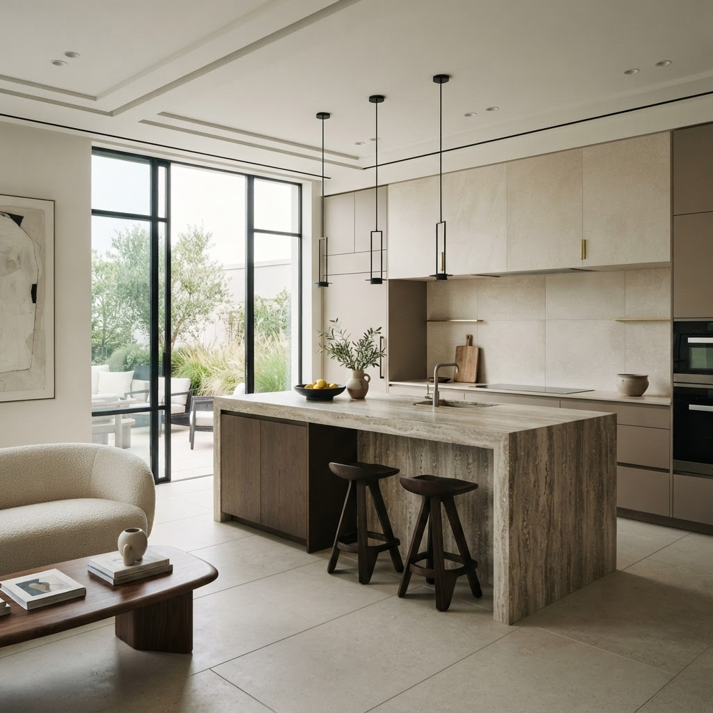
Featured application
Natural product. Modern performance.
Foundation
Warmth, without ornament.
Soft architectural neutrals give the imagery room to lead. A single clay accent adds humanity while the system stays crisp and controlled.
Paper#FFFFFF
Carbon#1D1D1F
Stone#73716C
Clay#A46042
Typography
One voice. Every scale.
Manrope for interface and display. Cormorant for the wordmark. Weight and scale—not decoration—build hierarchy.
Manrope / Display
Stone,
clearly.
Calacatta oro
Subtle gold movement across a luminous white field. A porcelain surface developed for precise fabrication and enduring architectural applications.
12 mmSilk finish126 × 63 in
Product language
The image does the talking.
Generous photography, plain-language labels, and essential specifications make comparison fast for the trade—and approachable for homeowners.
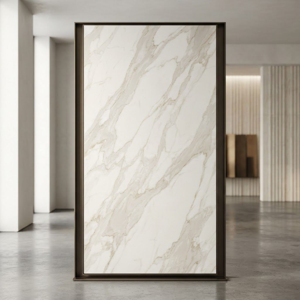 Premium
Porcelain · Silk
Calacatta oro
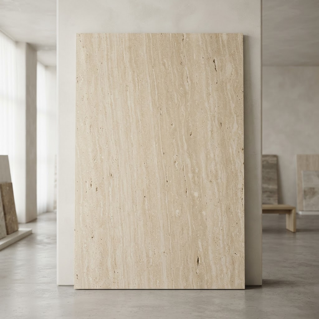 Signature
Travertine · Honed
Navona Linear
Interface
Only what helps you decide.
Controls are rounded, quiet, and immediately understandable. Price remains a tier, keeping the experience consultative rather than transactional.
⌘ K
Navigation
Four familiar ways in.
A compact sitemap lets every audience begin with product, appearance, application, or budget—then offers dedicated professional resources when needed.
By product
- Porcelain
- Marble
- Quartzite
- Travertine
By color
- White
- Warm neutral
- Gray
- Dark
By use
- Kitchen
- Bath
- Exterior
- Commercial
By tier
- Essential
- Premium
- Signature
- View all
Built for the trade.
Specifications, inventory, samples, and project support in one place.
Premium can still feel simple.
This page documents the tokens, typography, components, and navigation patterns used across the oro site.
Back to site